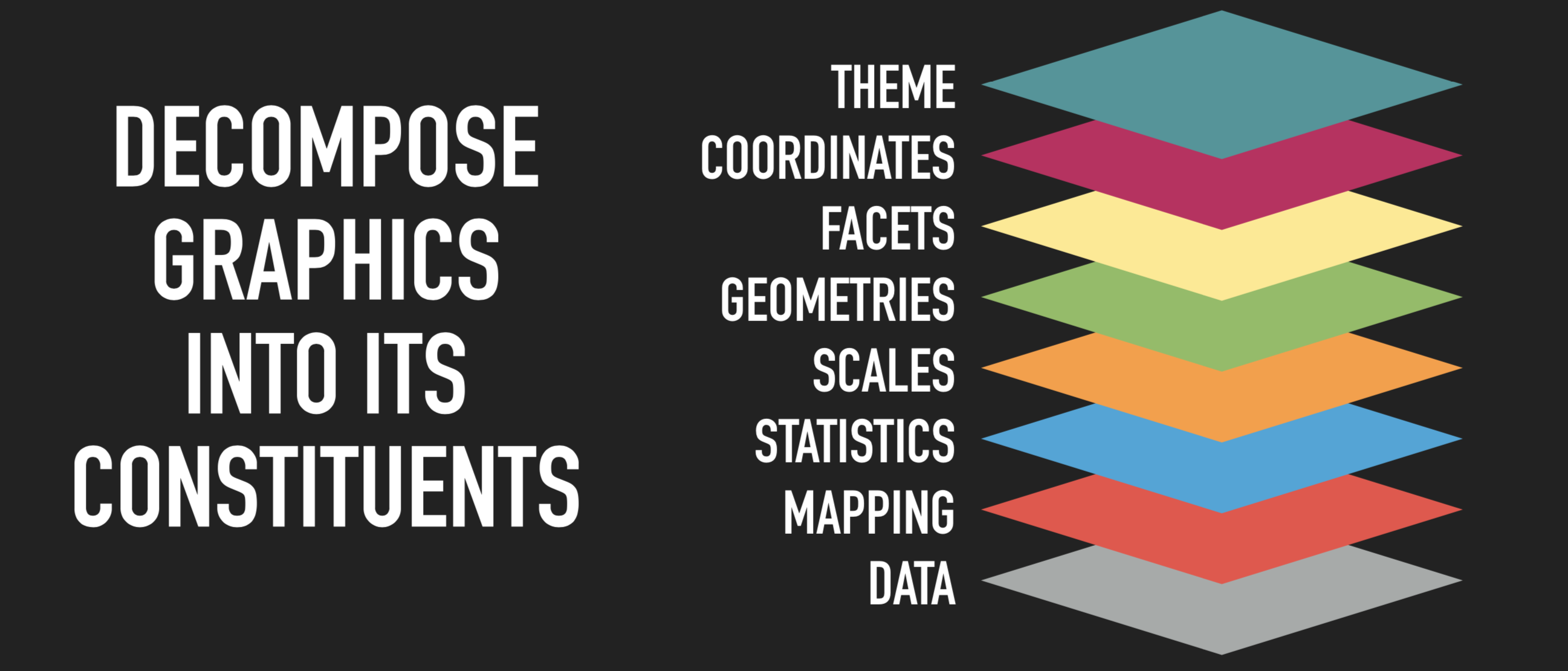
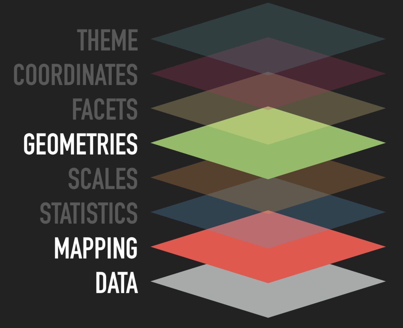
Grammar of Graphics
First published in 1999
- Foundation for many graphic applications
Grammar can be applied to every type of plot
Concisely describe components
Construct and deconstruct
Grammar of Graphics
Source: ggplot2 workshop by @thomasp85
Grammar of Graphics
Source: ggplot2 workshop by @thomasp85
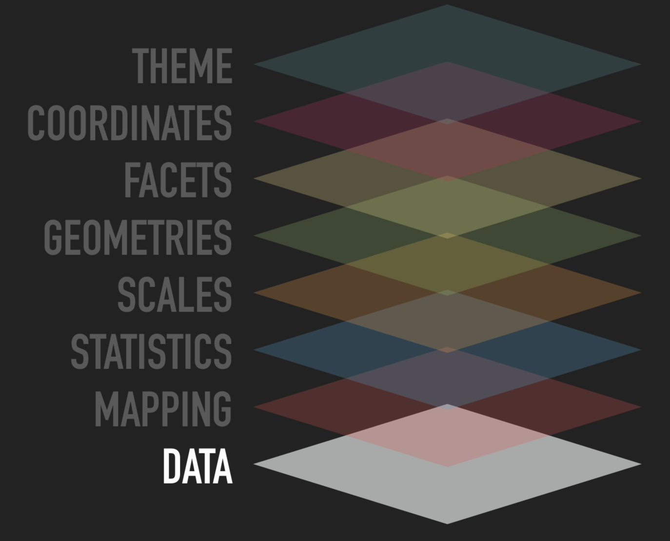
Your dataset
Tidy format
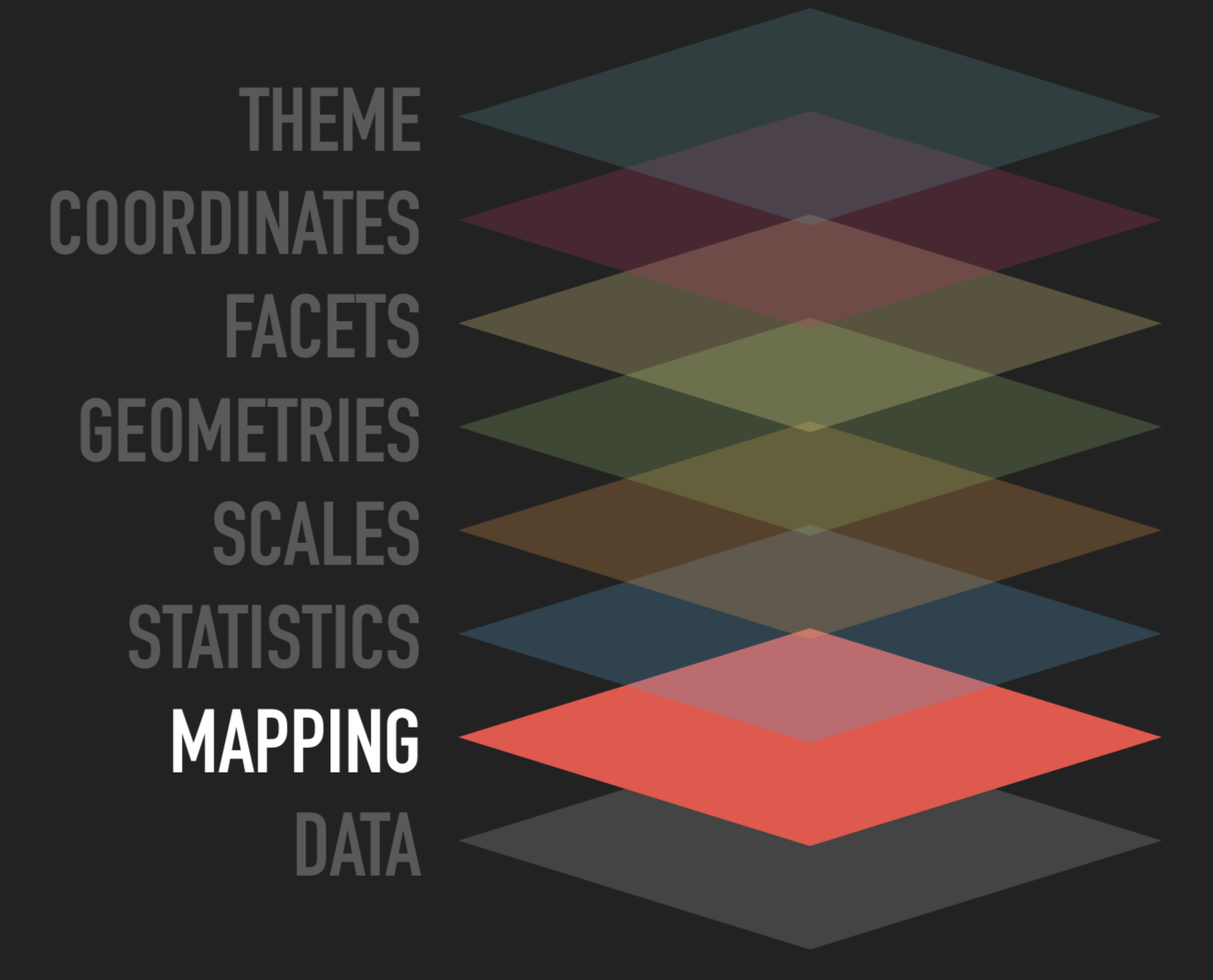
Grammar of Graphics
Source: ggplot2 workshop by @thomasp85
This is how we tell R which variables we want to plot
Aesthetics mapping
Links variable in the data to graphical propertiesFacets mapping
Links variable in data to panels in the plot layout
Grammar of Graphics
Source: ggplot2 workshop by @thomasp85
Even tidy data may need some transformation
Transform input variables to displayed values
- Bins for histogram
- Summary statistics for boxplot
- No. of observations in a category for bar chart
Implicit in many plot types
Grammar of Graphics
Source: ggplot2 workshop by @thomasp85
Help you interpret the plot
- Categories -> color
- Numeric -> position
Automatically generated in ggplot and can be customized
- log scale
- time series
Grammar of Graphics
Source: ggplot2 workshop by @thomasp85
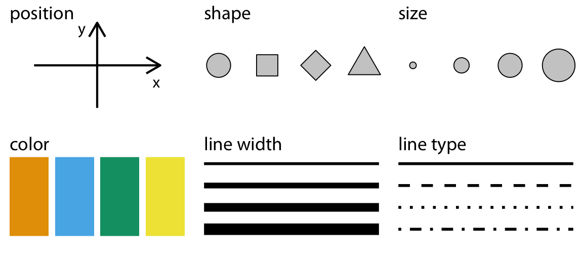
Aesthetics as graphical repersentations
Determines your plot type
- bar chart
- scatter
- boxplot
- ...
Grammar of Graphics
Source: ggplot2 workshop by @thomasp85
Divide your data into panels using one or two groups
Allows you to look at smaller subsets of data
Grammar of Graphics
Source: ggplot2 workshop by @thomasp85
Positions are interpreted by the coordinate system
Defines the physical mapping of the aesthetics
Grammar of Graphics
Source: ggplot2 workshop by @thomasp85
Overall look of the plot
Spans every part of the graphic that is not linked to the data
- "non-data ink"
Your first ggplot
ggplot(data=mpg)
Your first ggplot
ggplot(data=mpg)+ aes(x=displ)
Your first ggplot
ggplot(data=mpg)+ aes(x=displ)+ aes(y=hwy)
Your first ggplot
ggplot(data=mpg)+ aes(x=displ)+ aes(y=hwy)+ geom_point()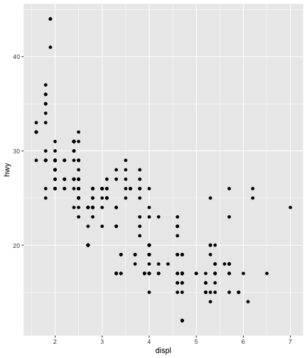
What did we need?
Source: ggplot2 workshop by @thomasp85
What did we need?
Source: ggplot2 workshop by @thomasp85
All other components use defaults
Let's look at the plot again
Aesthetics
ggplot(data=mpg)+ aes(x=displ)+ aes(y=hwy)+ geom_point()
Aesthetics
ggplot(data=mpg)+ aes(x=displ)+ aes(y=hwy)+ aes(color=class)+ geom_point()
Aesthetics
ggplot(data=mpg)+ aes(x=displ)+ aes(y=hwy)+ geom_point()
Aesthetics
ggplot(data=mpg)+ aes(x=displ)+ aes(y=hwy)+ aes(shape=class)+ geom_point()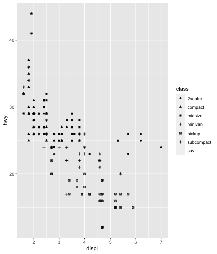
Aesthetics
Setting the properties of geom manually
ggplot(data = mpg) + geom_point(mapping = aes(x = displ, y = hwy), color = "blue")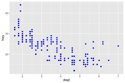
Aesthetics
Setting the properties of geom manually
ggplot(data = mpg) + geom_point(mapping = aes(x = displ, y = hwy), color = "blue")
Here, the color "blue" doesn’t convey information about a variable, but only changes the appearance of the plot
Aesthetics
To set a geometric property manually, place it outside of aes()
The name of a color as a character string
The size of a point in mm
The shape of a point as a number
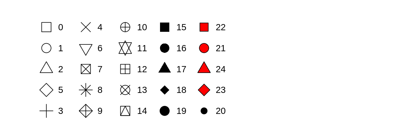 R has 25 built in shapes that are identified by numbers
Aesthetics
Remember aesthetics depend on geometry...
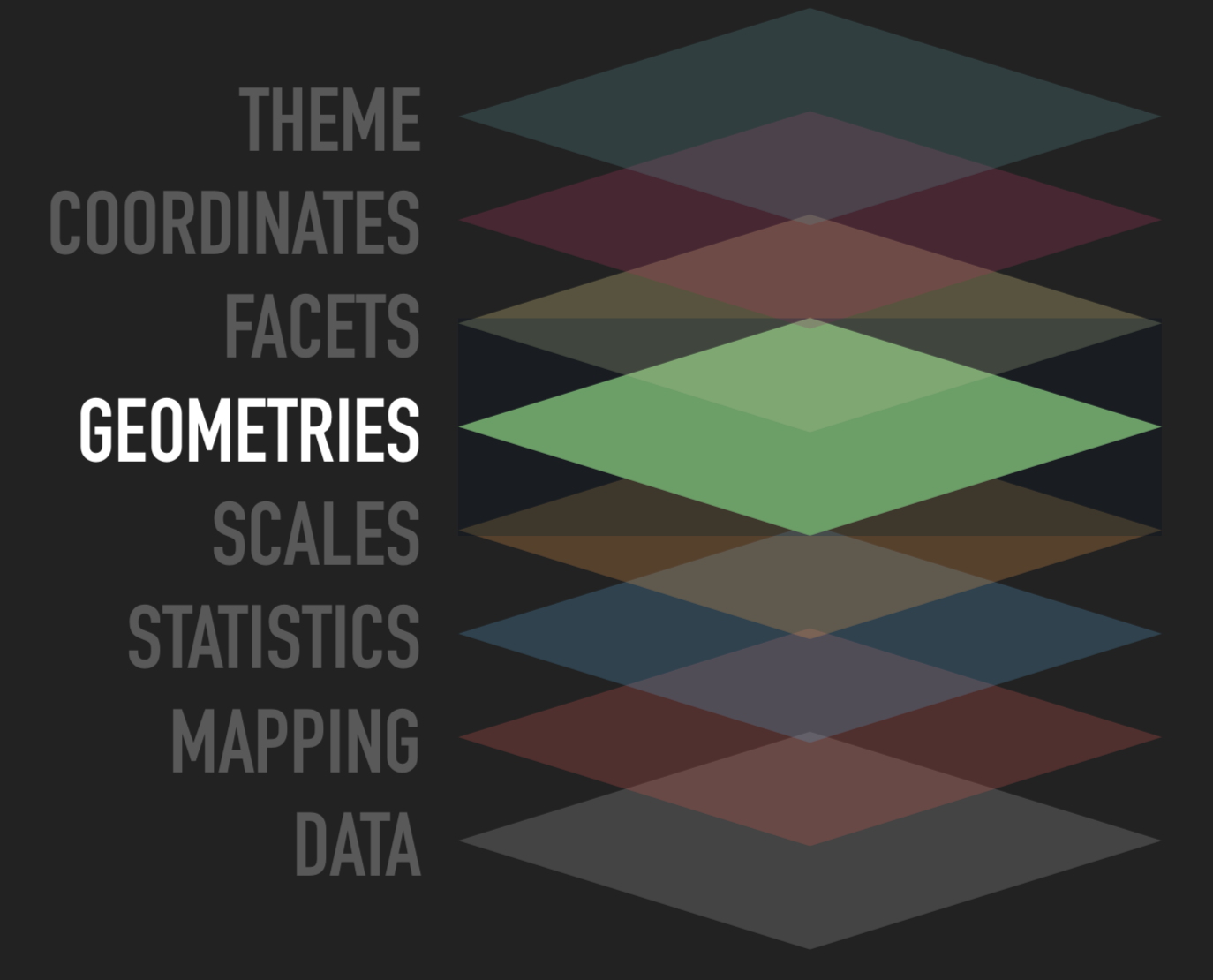
Geometric Objects
Both plots have the same x and y axes but use different geoms or geometries
Geometric Objects
Both plots have the same x and y axes but use different geoms or geometries
Geometric objects
ggplot(data = mpg)
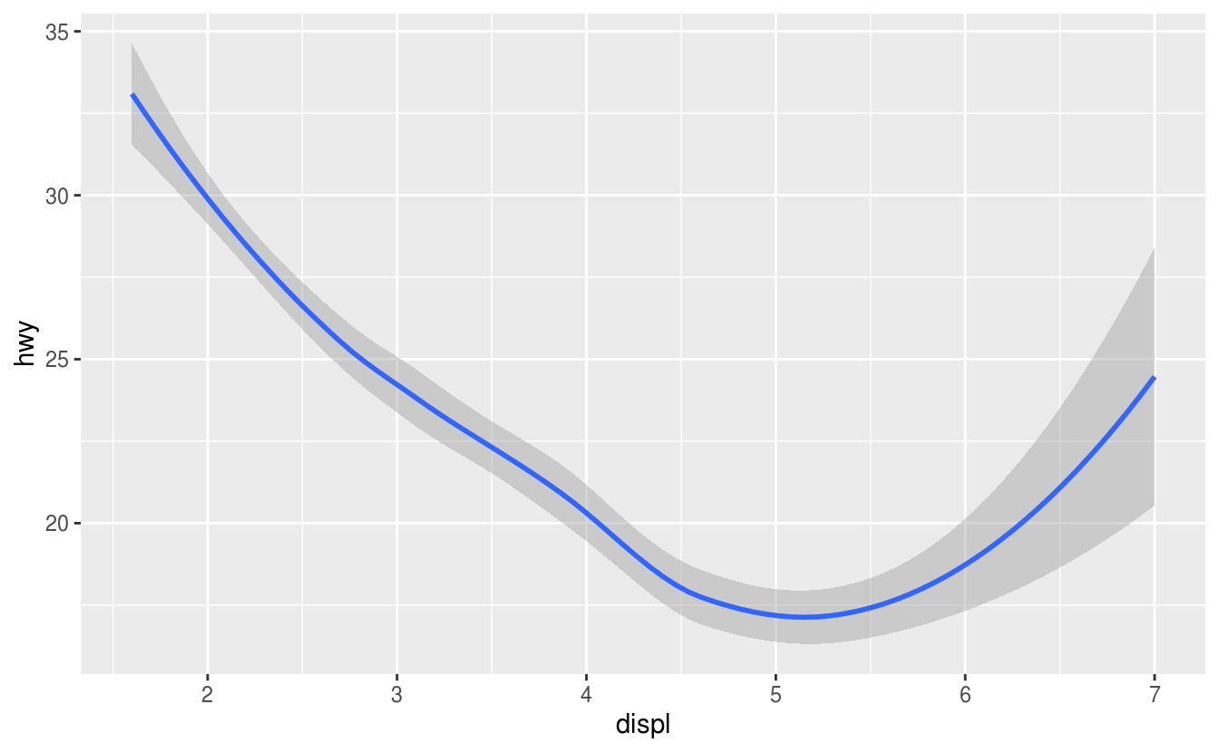
Geometric objects
ggplot(data = mpg) + geom_smooth(mapping = aes( x = displ, y = hwy, linetype = drv))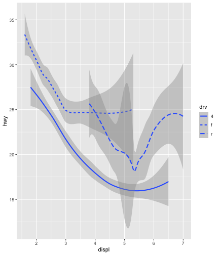
Mulitple geoms
ggplot(data = mpg)
Mulitple geoms
ggplot(data = mpg) + geom_point(mapping = aes( x = displ, y = hwy))
Mulitple geoms
ggplot(data = mpg) + geom_point(mapping = aes( x = displ, y = hwy)) + geom_smooth(mapping = aes( x = displ, y = hwy))
Mulitple geoms
ggplot(data = mpg) + geom_point(mapping = aes( x = displ, y = hwy)) + geom_smooth(mapping = aes( x = displ, y = hwy))
Mulitple geoms
ggplot(data = mpg, mapping = aes (x = displ, y = hwy))
Mulitple geoms
ggplot(data = mpg, mapping = aes (x = displ, y = hwy)) + geom_point()
Mulitple geoms
ggplot(data = mpg, mapping = aes (x = displ, y = hwy)) + geom_point() + geom_smooth()
Mulitple geoms
ggplot(data = mpg, mapping = aes (x = displ, y = hwy)) + geom_point() + geom_smooth()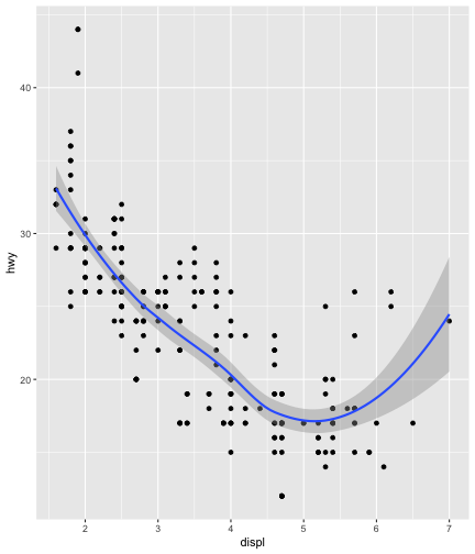
Mulitple geoms
ggplot(data = mpg, mapping = aes( x = displ, y = hwy))
Mulitple geoms
ggplot(data = mpg, mapping = aes( x = displ, y = hwy)) + geom_point( mapping = aes( color = class))
Mulitple geoms
ggplot(data = mpg, mapping = aes( x = displ, y = hwy)) + geom_point( mapping = aes( color = class)) + geom_smooth()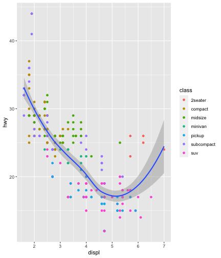
Mulitple geoms
ggplot(data = mpg, mapping = aes( x = displ, y = hwy)) + geom_point( mapping = aes( color = class)) + geom_smooth()
Mulitple geoms
ggplot(data = mpg, mapping = aes( x = displ, y = hwy))
Mulitple geoms
ggplot(data = mpg, mapping = aes( x = displ, y = hwy)) + geom_point( mapping = aes( color = class))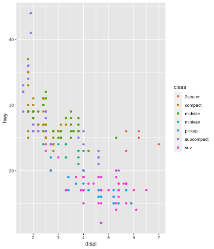
Mulitple geoms
ggplot(data = mpg, mapping = aes( x = displ, y = hwy)) + geom_point( mapping = aes( color = class)) + geom_smooth(data = filter(mpg, class == "suv"), se = FALSE)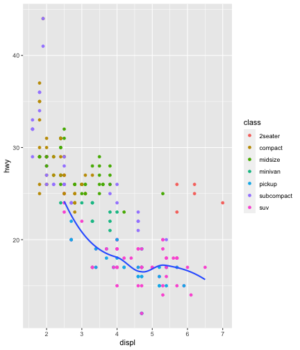
Mulitple geoms
ggplot(data = mpg, mapping = aes( x = displ, y = hwy)) + geom_point( mapping = aes( color = class)) + geom_smooth(data = filter(mpg, class == "suv"), se = FALSE)
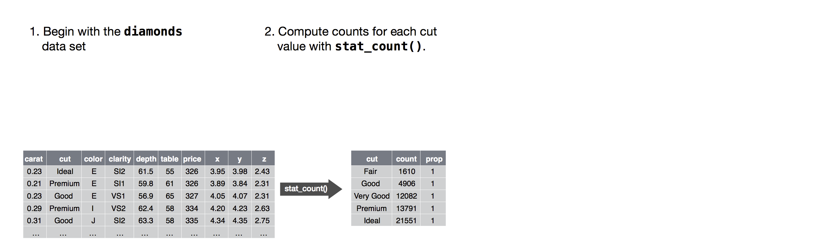
Statistical Transformations
Linked to geometries
Every
geomhas a defaultstatand vice versaCan use
geom_*()andstat_()*interchangeably but former is more common
Statistical Transformations
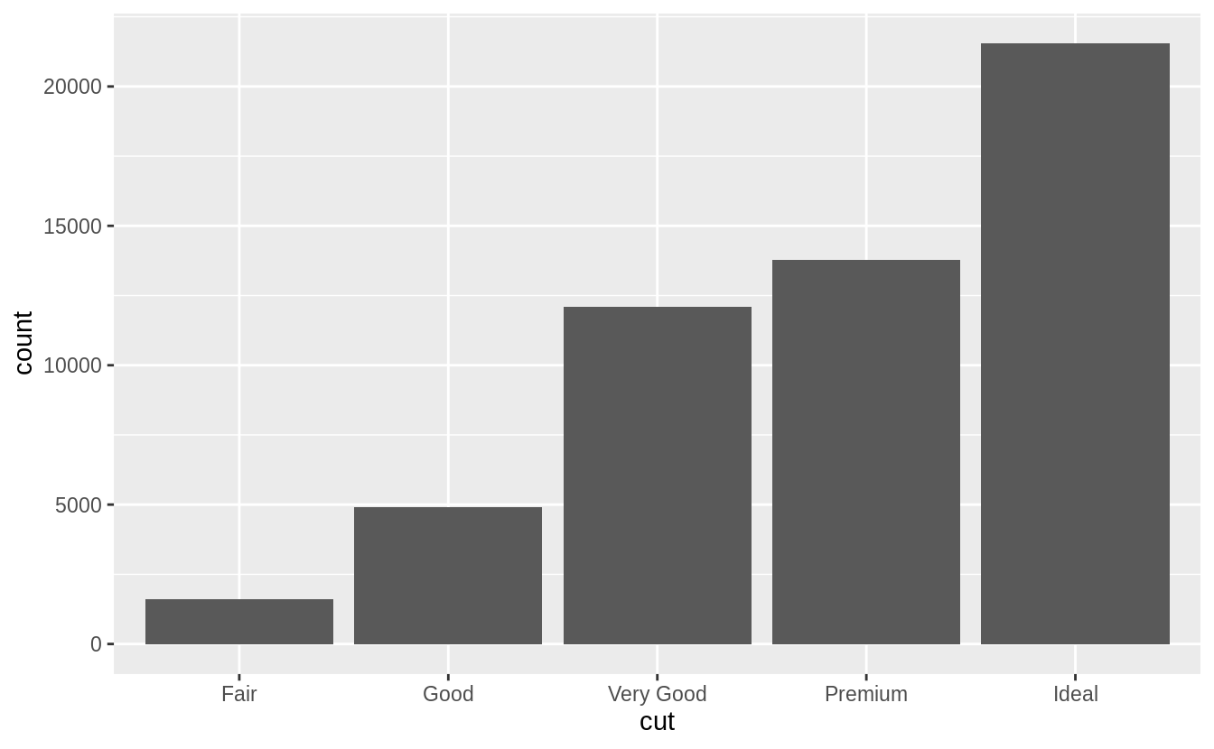
ggplot(data = diamonds) + geom_bar(mapping = aes(x = cut))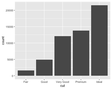
Statistical Transformations
ggplot(data = diamonds) + geom_bar(mapping = aes(x = cut))
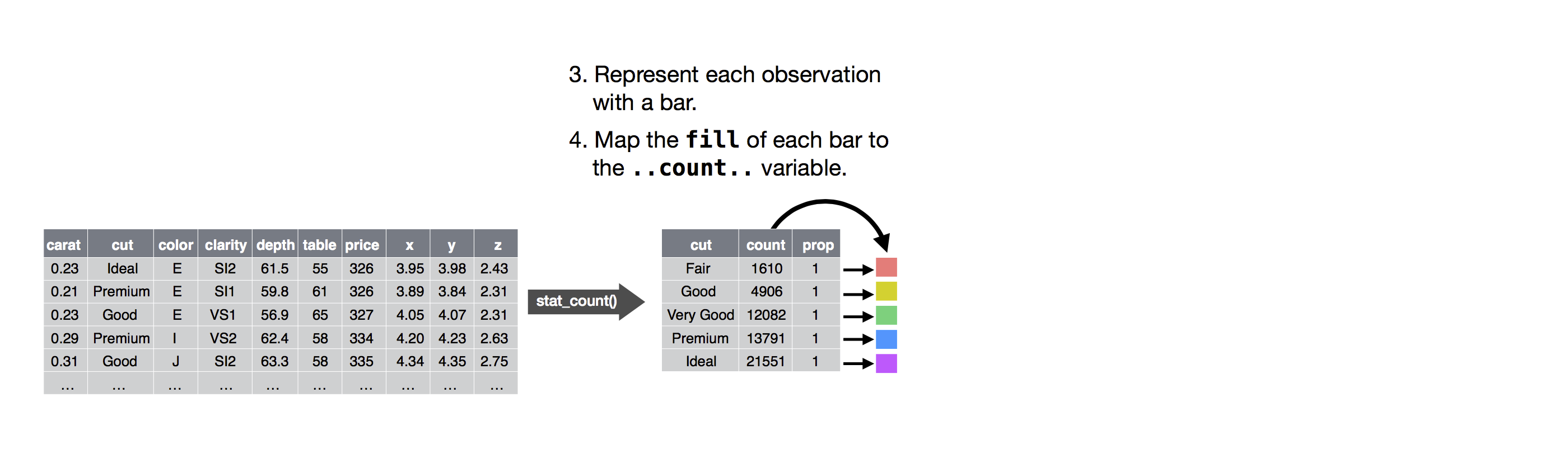
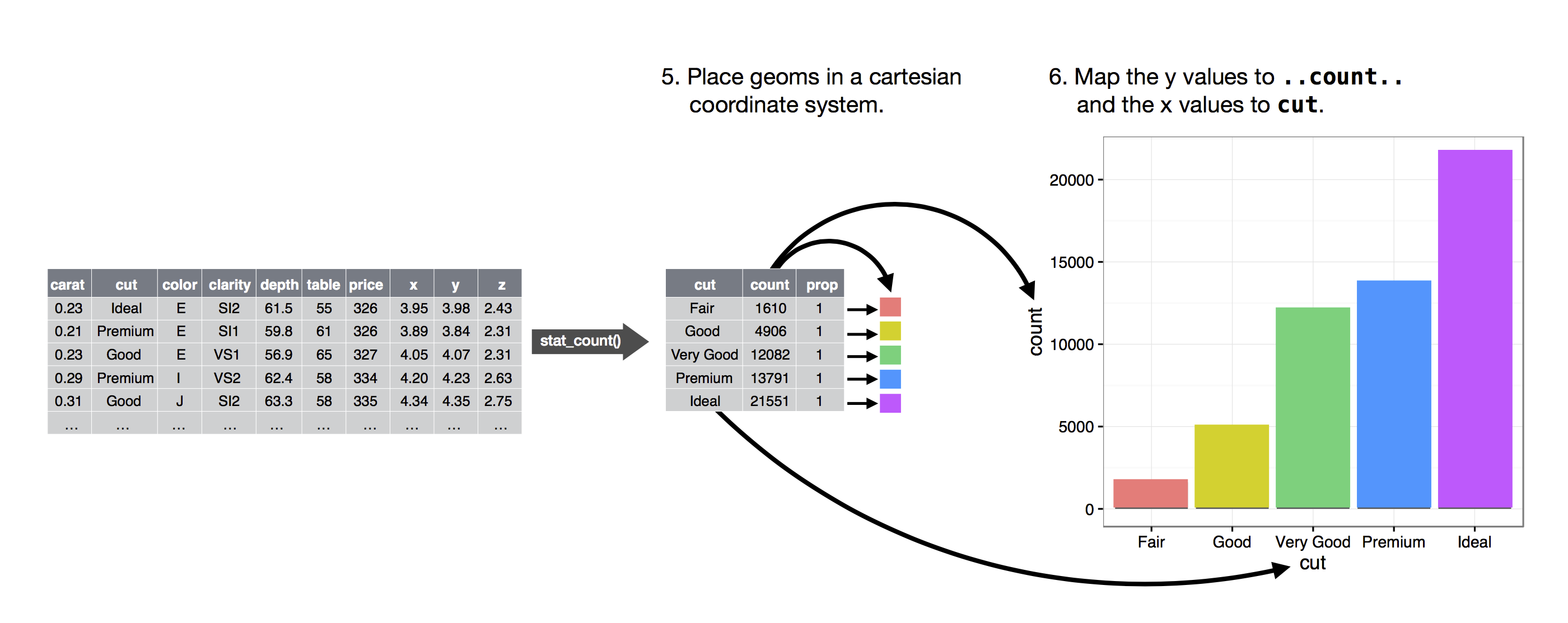
Where does count on y-axis come from?
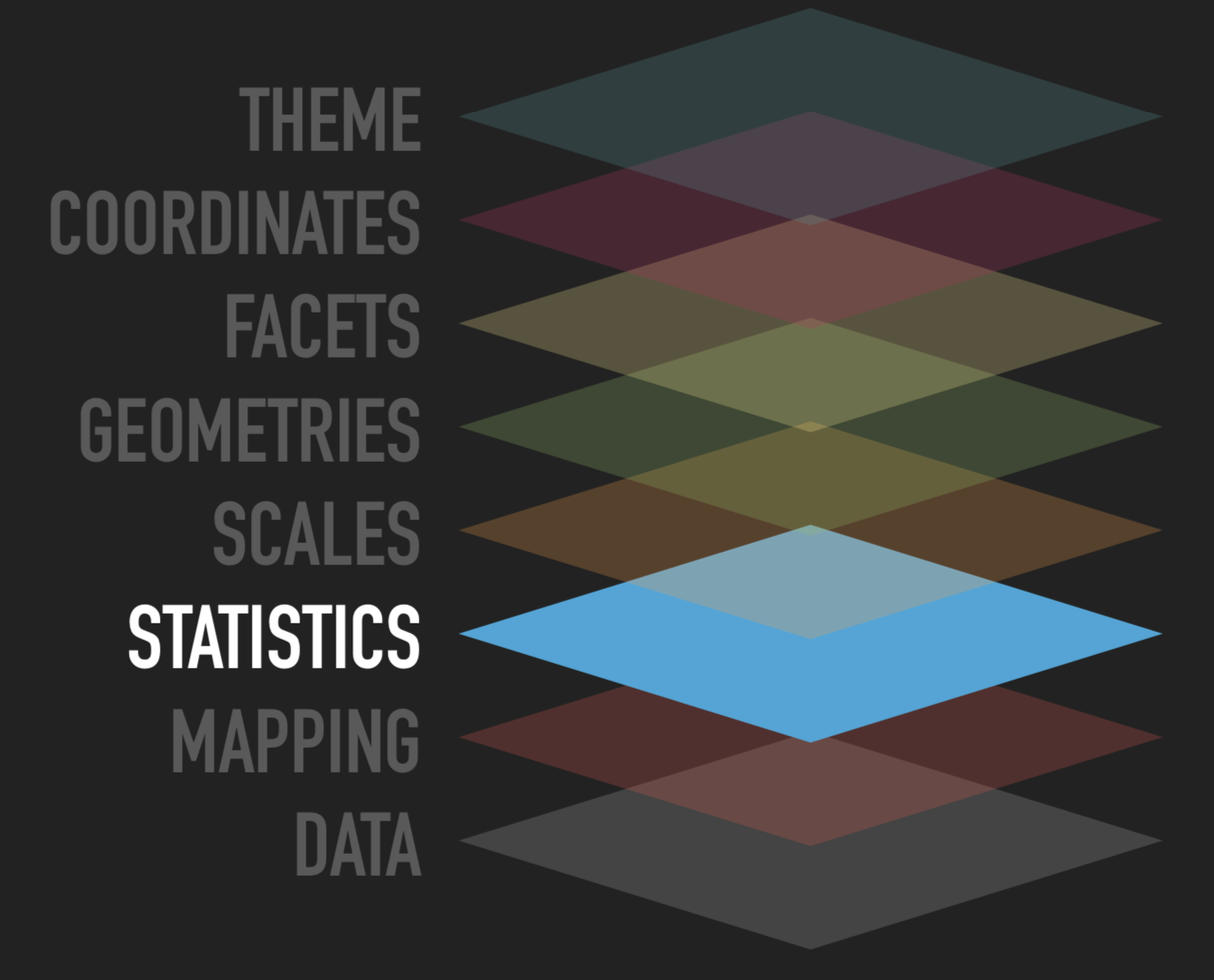
Statistical Transformations
Some plots calculate new values from the data
Bar charts and histograms
smoothing functions
boxplots
Statistical Transformations
Some plots calculate new values from the data
Bar charts and histograms
smoothing functions
boxplots
The algorithm used to calculate new values for a graph is called a stat, short for statistical transformation
Statistical Transformations
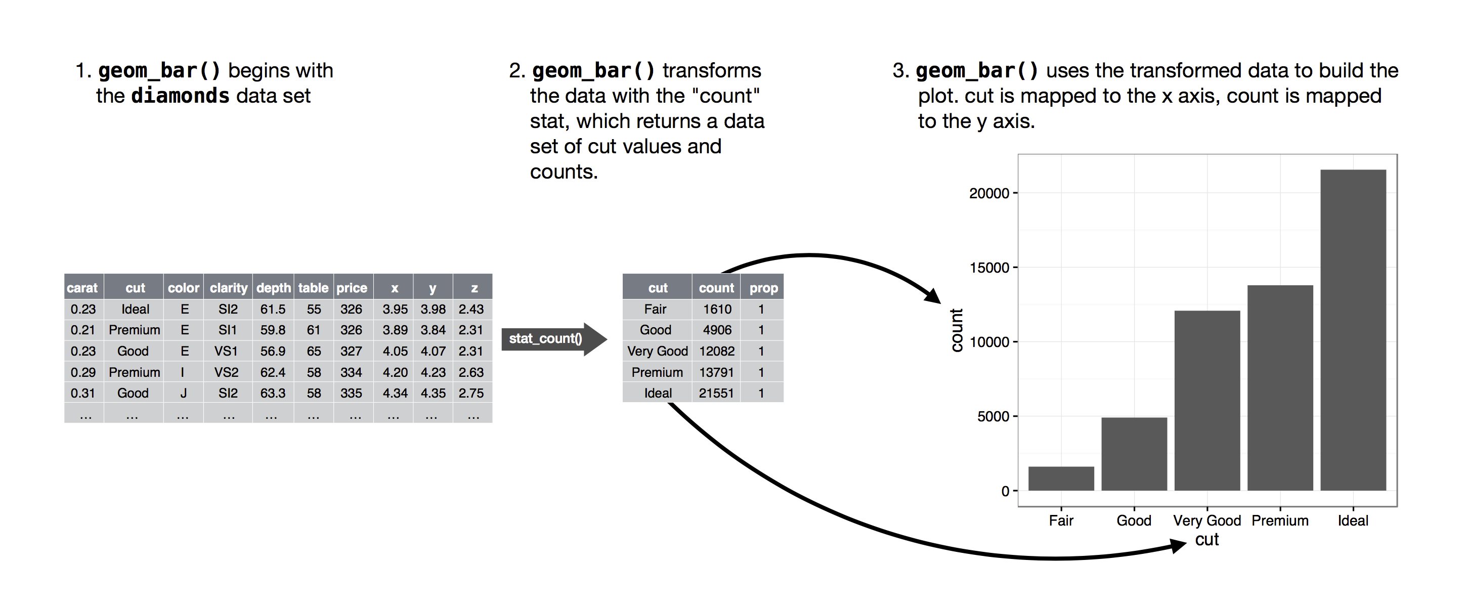
You can find out which stat each geom uses by looking at the default value of the stat argument of the help page.
What it the default stat for geom_bar?
Statistical Transformations
- Overriding default options
- Here, display bar chart of proportions instead of count
ggplot(data = diamonds) + geom_bar(mapping = aes(x = cut, y = stat(prop), group = 1))
Position Adjustments
ggplot(data = diamonds) + geom_bar(mapping = aes(x = cut, colour = cut))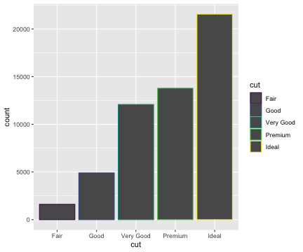
Position Adjustments
ggplot(data = diamonds) + geom_bar(mapping = aes(x = cut, fill = cut))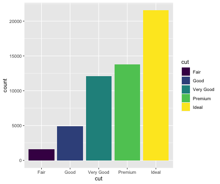
Position Adjustments
ggplot(data = diamonds) + geom_bar(mapping = aes(x = cut, fill = clarity))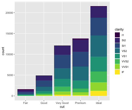
position="identity"
- places each object exactly where it falls in the context of the graph
- useful if bars are made transparent
ggplot(data = diamonds, mapping = aes(x = cut, colour = clarity)) + geom_bar(fill = NA, position = "identity")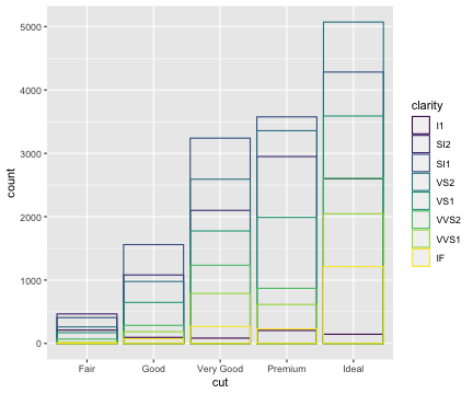
position="fill"
- makes each set of stacked bars the same height
- Useful for comparing proportions across groups
ggplot(data = diamonds) + geom_bar(mapping = aes(x = cut, fill = clarity), position = "fill")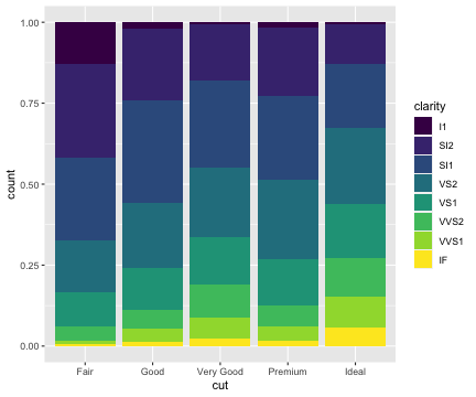
position="dodge"
- Places objects next to each other
- Useful for comparing individual values
ggplot(data = diamonds) + geom_bar(mapping = aes(x = cut, fill = clarity), position = "dodge")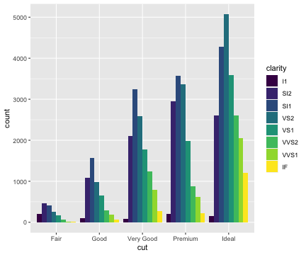
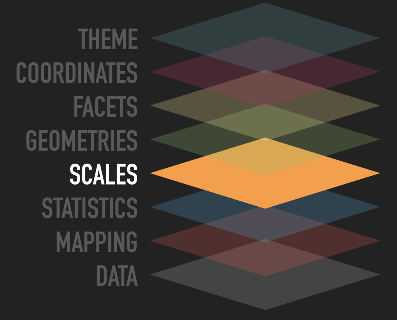
Scales
Source: ggplot2 workshop by @thomasp85
Everything inside
aes()will have a scale by defaultscale_<aesthetic>_<type>()<type>can either be a generic (continuous, discrete, or binned) or specific (e.g. area, for scaling size to circle area)
Scales
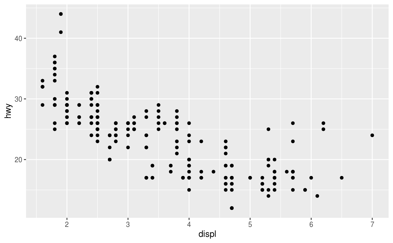
ggplot(mpg) + geom_point(aes(x = displ, y = hwy, colour = class))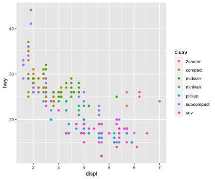
Scales
ggplot(mpg) + geom_point(aes(x = displ, y = hwy, colour = class))+ scale_colour_brewer(type = 'qual')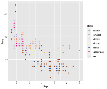
Scales
ggplot(mpg) + geom_point(aes(x = displ, y = hwy)) + scale_x_continuous(breaks = c(3, 5, 6)) + scale_y_continuous(trans = 'log10')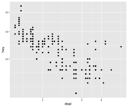
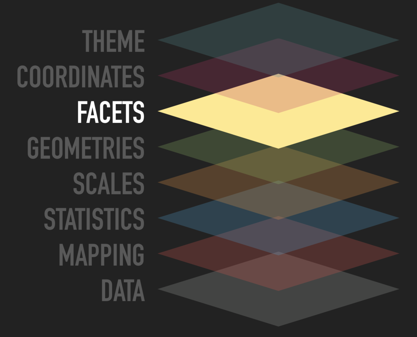
Facets
Source: ggplot2 workshop by @thomasp85
Split data into multiple panels
Another way to add additional variable
Useful for categorical variables
Facet by a single variable
facet_wrap()Facet by two variables
facet_grid()
Facets
ggplot(data = mpg)
Facets
ggplot(data = mpg) + geom_point(mapping = aes( x = displ, y = hwy))
Facets
ggplot(data = mpg) + geom_point(mapping = aes( x = displ, y = hwy)) + facet_wrap(~ class, nrow = 2)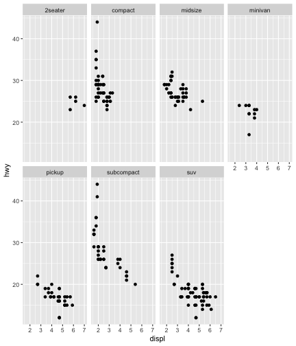
Facets
ggplot(data = mpg)
Facets
ggplot(data = mpg) + geom_point(mapping = aes( x = displ, y = hwy))
Facets
ggplot(data = mpg) + geom_point(mapping = aes( x = displ, y = hwy)) + facet_grid(drv ~ cyl)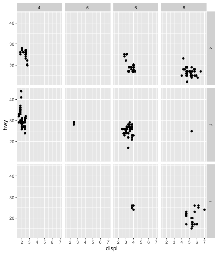
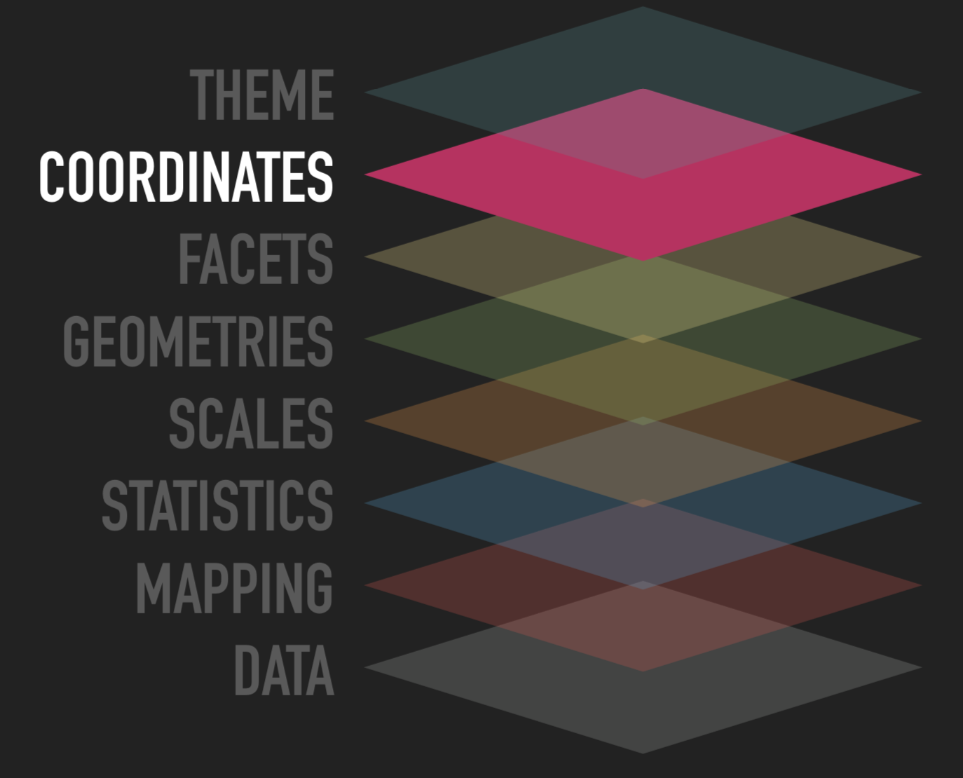
Coordinates
Source: ggplot2 workshop by @thomasp85
Defining your plot canvas
- How should x and y be interpreted?
Default is the Cartesian coordinate system
Useful for spatial data (map projections)
Coordinate Systems
ggplot(data = mpg, mapping = aes( x = class, y = hwy))
Coordinate Systems
ggplot(data = mpg, mapping = aes( x = class, y = hwy)) + geom_boxplot()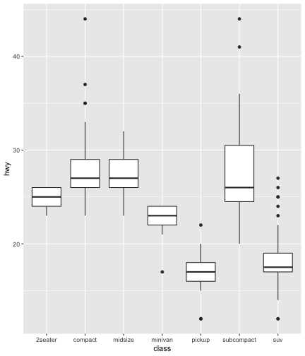
Coordinate Systems
ggplot(data = mpg, mapping = aes( x = class, y = hwy)) + geom_boxplot() + coord_flip()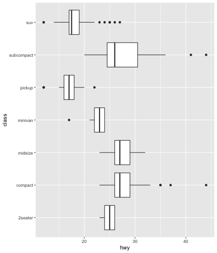
Coordinate Systems
ggplot(data = mpg, mapping = aes( x = class, y = hwy)) + geom_boxplot() + coord_flip()
Coordinate Systems
ggplot(data = mpg, mapping = aes( x = class, y = hwy))
Coordinate Systems
ggplot(data = mpg, mapping = aes( x = class, y = hwy)) + geom_point(position = "jitter")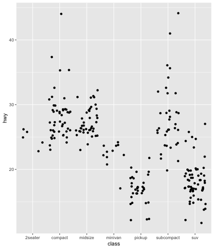
Coordinate Systems
ggplot(data = mpg, mapping = aes( x = class, y = hwy)) + geom_point(position = "jitter") + coord_polar()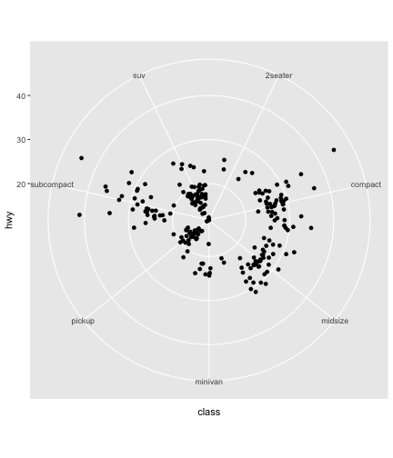
Coordinate Systems
ggplot(data = mpg, mapping = aes( x = class, y = hwy)) + geom_point(position = "jitter") + coord_polar()
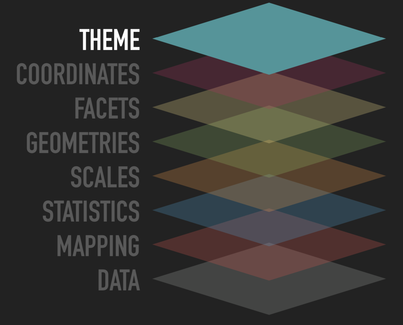
Themes
Source: ggplot2 workshop by @thomasp85
Style changes that are not related to data
Can apply built-in themes or modify each element separately
Follows hierarchy i.e. changes in the upper level percolate to lower levels
Themes
ggplot(data=mpg)+ aes(x=displ)+ aes(y=hwy)+ geom_point()+ theme_classic()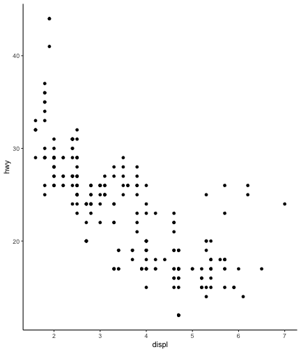
Themes
ggplot(data=mpg)+ aes(x=displ)+ aes(y=hwy)+ geom_point()+ theme_minimal()
Themes
ggplot(data=mpg)+ aes(x=displ)+ aes(y=hwy)+ geom_point()+ theme_dark()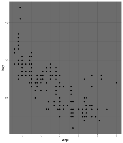
Themes
ggplot(data=mpg, aes(x=displ, y=hwy))+geom_point()+ theme( panel.grid.major = element_line('white',size = 0.5), panel.grid.minor = element_blank(), panel.grid.major.y = element_blank(), panel.border = element_rect(colour = "blue", fill = NA, linetype = 2), panel.background = element_rect(fill = "aliceblue"), axis.title = element_text(colour = "blue", face = "bold", family = "Times"), axis.text=element_text(face="bold") )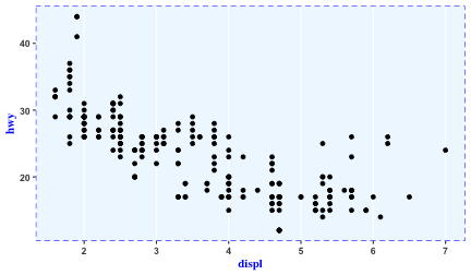
Adding labels to your plot
ggplot(data=mpg)
Adding labels to your plot
ggplot(data=mpg)+ aes(x=displ)
Adding labels to your plot
ggplot(data=mpg)+ aes(x=displ)+ aes(y=hwy)
Adding labels to your plot
ggplot(data=mpg)+ aes(x=displ)+ aes(y=hwy)+ geom_point()
Adding labels to your plot
ggplot(data=mpg)+ aes(x=displ)+ aes(y=hwy)+ geom_point()+ theme_minimal()
Adding labels to your plot
ggplot(data=mpg)+ aes(x=displ)+ aes(y=hwy)+ geom_point()+ theme_minimal()+ labs(x="Displacement")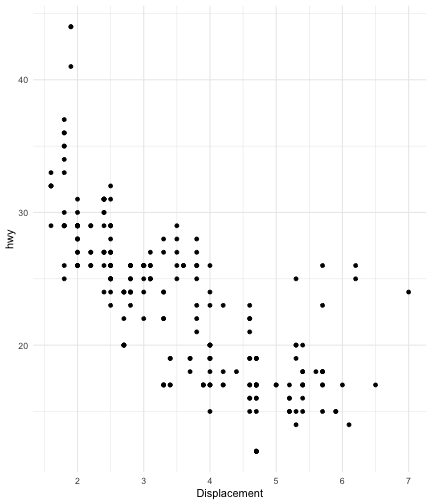
Adding labels to your plot
ggplot(data=mpg)+ aes(x=displ)+ aes(y=hwy)+ geom_point()+ theme_minimal()+ labs(x="Displacement")+ labs(y="Highway Mileage")
Adding labels to your plot
ggplot(data=mpg)+ aes(x=displ)+ aes(y=hwy)+ geom_point()+ theme_minimal()+ labs(x="Displacement")+ labs(y="Highway Mileage")+ labs(title="My first GGPLOT")
Adding labels to your plot
ggplot(data=mpg)+ aes(x=displ)+ aes(y=hwy)+ geom_point()+ theme_minimal()+ labs(x="Displacement")+ labs(y="Highway Mileage")+ labs(title="My first GGPLOT")+ labs(subtitle="This is the subtitle")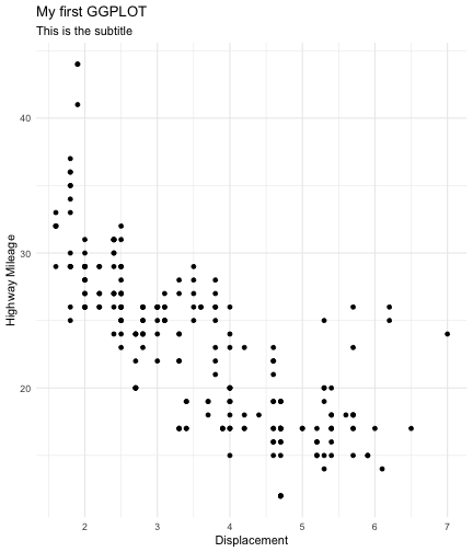
Adding labels to your plot
ggplot(data=mpg)+ aes(x=displ)+ aes(y=hwy)+ geom_point()+ theme_minimal()+ labs(x="Displacement")+ labs(y="Highway Mileage")+ labs(title="My first GGPLOT")+ labs(subtitle="This is the subtitle")+ labs(caption="Source:mpg dataset")
GGPLOT object
myplot <- ggplot(data=mpg)+ aes(x=displ)+ aes(y=hwy)+ geom_point()+ theme_minimal()myplot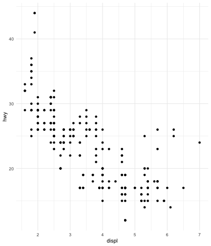
GGPLOT object
myplot <- ggplot(data=mpg)+ aes(x=displ)+ aes(y=hwy)+ geom_point()+ theme_minimal()myplot+ labs(x="Displacement")
GGPLOT object
myplot <- ggplot(data=mpg)+ aes(x=displ)+ aes(y=hwy)+ geom_point()+ theme_minimal()myplot+ labs(x="Displacement")+ labs(y="Highway Mileage")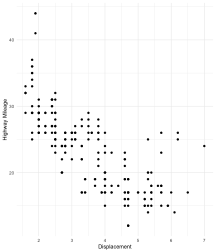
GGPLOT object
myplot <- ggplot(data=mpg)+ aes(x=displ)+ aes(y=hwy)+ geom_point()+ theme_minimal()myplot+ labs(x="Displacement")+ labs(y="Highway Mileage")+ labs(title="My first GGPLOT")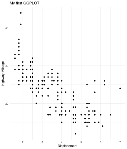
GGPLOT object
myplot <- ggplot(data=mpg)+ aes(x=displ)+ aes(y=hwy)+ geom_point()+ theme_minimal()myplot+ labs(x="Displacement")+ labs(y="Highway Mileage")+ labs(title="My first GGPLOT")+ labs(subtitle="This is the subtitle")
GGPLOT object
myplot <- ggplot(data=mpg)+ aes(x=displ)+ aes(y=hwy)+ geom_point()+ theme_minimal()myplot+ labs(x="Displacement")+ labs(y="Highway Mileage")+ labs(title="My first GGPLOT")+ labs(subtitle="This is the subtitle")+ labs(caption="Source:mpg dataset")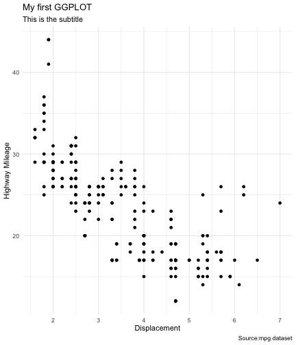
The layered grammar of graphics
R for Data Science by Hadley WickHam
The layered grammar of graphics
R for Data Science by Hadley WickHam
The layered grammar of graphics
R for Data Science by Hadley WickHam
Plot Composition

patchworkpackageCombining different types of plots in a single layout
install.packages("patchwork") library(patchwork)Plot Composition
library(ggplot2)library(patchwork)p1 <- ggplot(mpg) + geom_point(aes(displ, hwy)) # first plotp2 <- ggplot(mpg) + geom_boxplot(aes(displ, hwy, group = class)) # second plot p1+p2 # combined plot output using patchwork package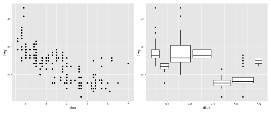
Plot Composition
p3 <- ggplot(mpg, aes(displ, hwy))+geom_point(aes(color=class))+geom_smooth(aes(color=class))p4 <- ggplot(mpg) + geom_bar(aes(class))(p1 | p2 | p3) / p4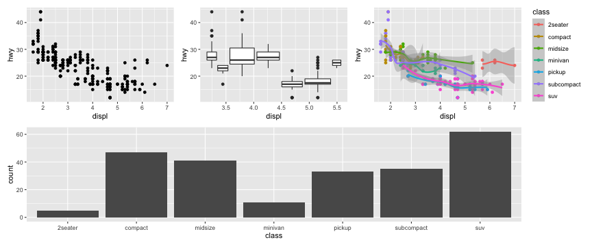
Plot Annotation


can add annotations by code
packages
ggrepelandggforce
Plot Annotation
ggplot(mpg[1:20,], aes(x = displ, y = hwy)) + geom_point() + geom_text(aes(label = model))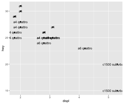
Plot Annotation
library(ggrepel)ggplot(mpg[1:20,], aes(x = displ, y = hwy)) + geom_point() + geom_text_repel(aes(label = model))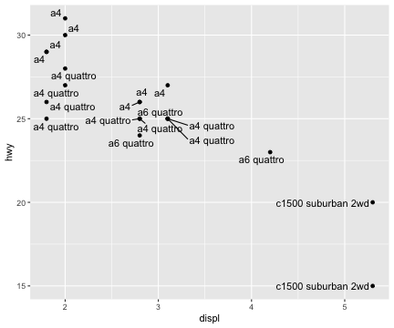
Plot Annotation
library(ggforce)ggplot(mpg, aes(x = displ, y = hwy)) + geom_point()+ geom_mark_ellipse( aes(filter = class == "2seater", label = '"2 seater"/Sports Cars', description = 'Sports cars have large engines but small bodies, which improves their mileage'))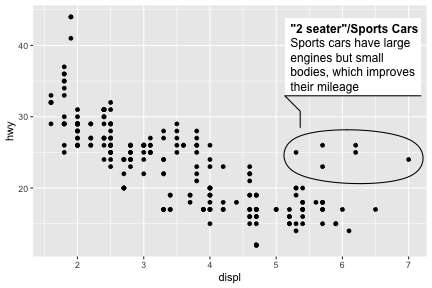
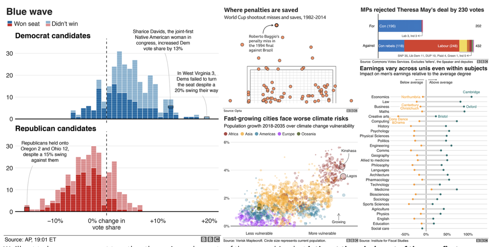
What next?
ggplot2extensions- Rstudio cheatsheet
- BBC Visual and Data Journalism cookbook for R graphics